After completing the first project, we were given a task of completing another one with everything we have learned since the start. My idea was creating a user experience that aided consumers in learning to read in another language.
Project Overview

The product: Language Learn is a organization focused on helping people learn to read in another language. Language Learn’s primarily targets users of all ages who want to learn to read in a new language whether for work or travel.
Project duration: August 2023
The problem: People who conduct international business and/or travel internationally have expressed trouble with communications in other countries.
The goal: Design an app that will improve education on the learning a new language and help people retain information more.
My role: UX designer leading the app and responsive website design from conception to delivery
Responsibilities: Conducting interviews, paper and digital wireframing, low and high-fidelity prototyping, conducting usability studies, accounting for accessibility, iterating on designs, determining information architecture, and responsive design.
User Research


Summary
I used personal data on language learning to develop interview questions, which were then used to conduct user interviews. Most interview participants reported feeling frustrated, but they didn’t actively try to improve their language learning education. The feedback received through research made it very clear that users would be open and willing to work towards reading in another language if they had access to an easy-to-use tool to help guide them.
Starting The Design
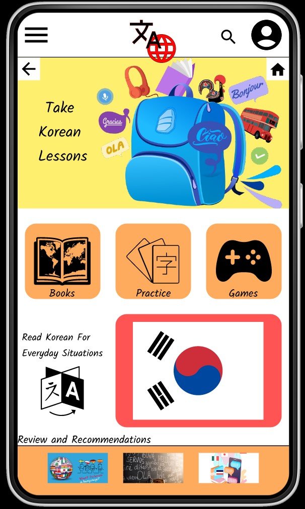
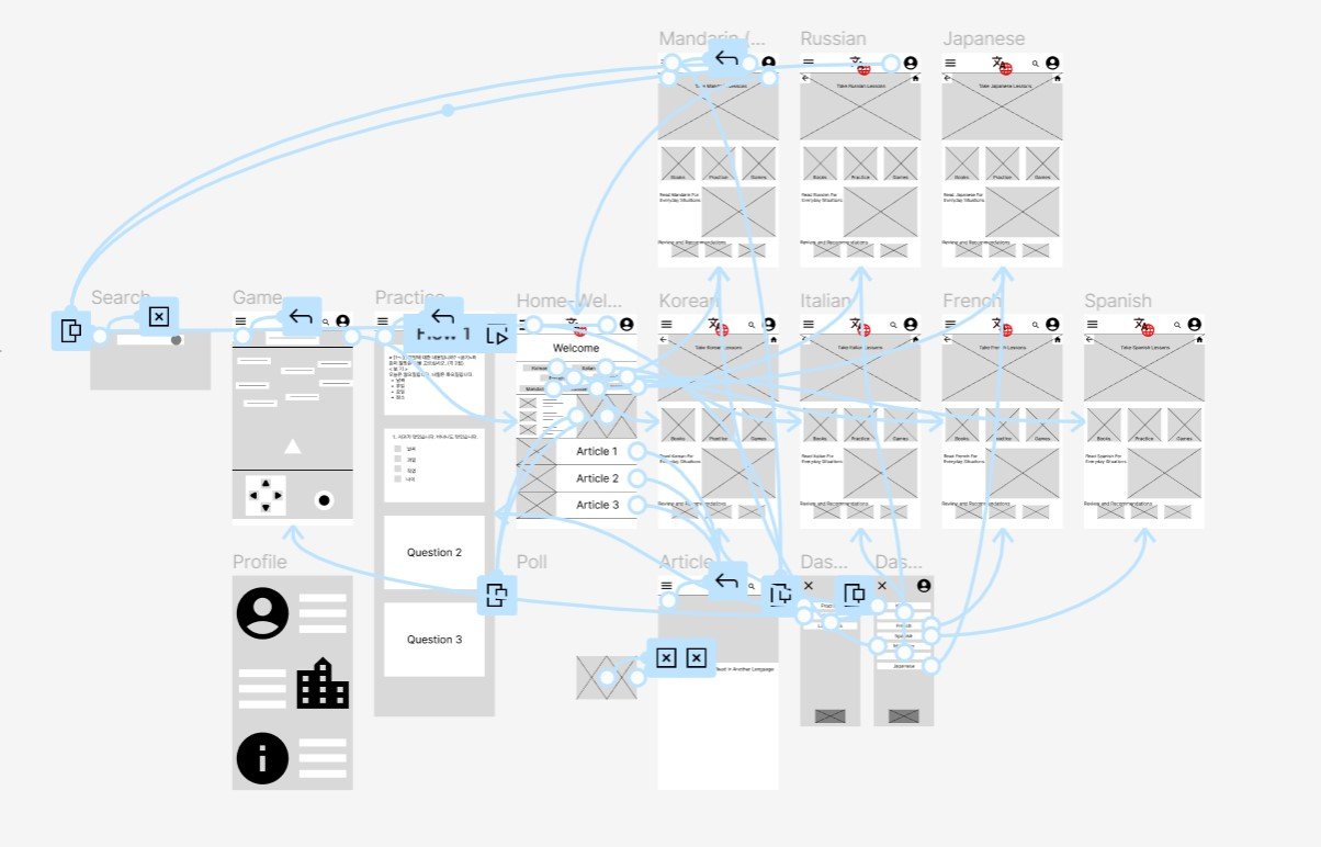
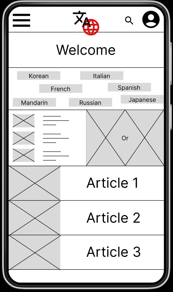
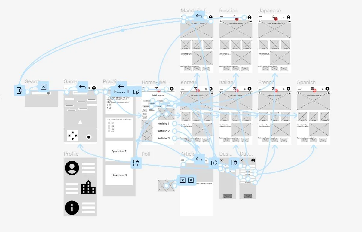
I conducted an ideation exercise to address gaps in a competitive audit, focusing on reading ability in a new language. After drafting paper wireframes, they created initial designs for the Language Learn app, delivering multiple efficient ways to learn new languages. A low-fidelity prototype was created for usability testing.


Refining The Design
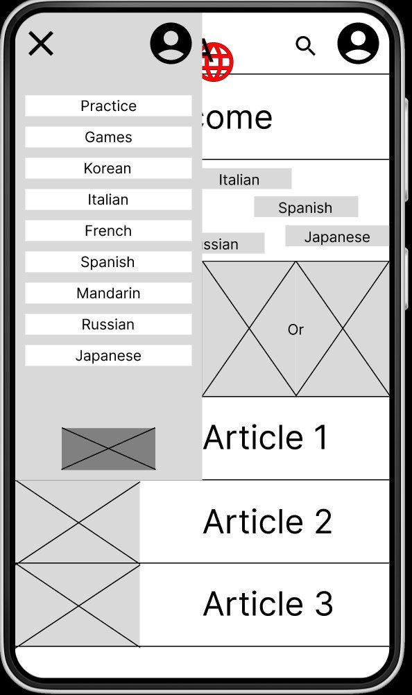
The usability studies led to design changes, including consolidating language lists, adding typography and iconography, and altering layouts for question and check boxes.
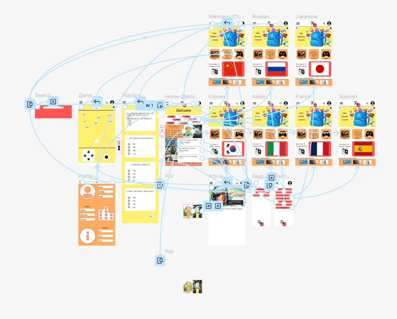
The high-fidelity prototype followed the same user flow as the low-fidelity prototype, including the changes made after the usability study.
Accessibility Considerations
Clear labels for interactive elements that can be read by screen readers.
Initial focus of the home screen on personalized recommendations help define the primary task or action for the user.