This year was the start of my journey into learning product design,
I was given a project during my course to design a UX/UI experience that allows users to preview their dream wedding.
Product Overview

The product: I Do Visions is a wedding planning company located in central MS. I Do Visions strives to offer personal tailored wedding design options. I Do Visions targets customers likes engaged couples who need help planning the wedding of their dreams.
Project duration: May 2023 to July 2023
The problem: Engaged couples feeling overwhelmed at planning their wedding.
The goal: Design an app that allows users to easily manage wedding planning from design ideas to venue and catering quotas.
My role: IUX designer designing an app, I Do Visions, from conception to delivery.
Responsibilities: Conducting interviews, paper and digital wireframing, low and high-fidelity prototyping, conducting usability studies, accounting for accessibility, and iterating on designs.
User Research


Summary:
I conducted interviews and created empathy maps to understand the users I’m designing for and their needs. A primary user group identified through research was working adults who don’t have time to plan their wedding. This user group confirmed initial assumptions about customers, but research also revealed that time was not the only factor limiting users from planning their weddings. Other user problems included obligations, lack of wedding knowledge, or creative challenges that make it difficult for users to decide what their weddings will look like.
Pain Points:
Time- Working adults are too busy to spend a lot of time on wedding planning.
Lack of Creativity- Adults have expressed not knowing at all what they want their weddings to look like.
Accessibility- Platforms for ordering food are not equipped with assistive technologies.
Overwhelmed- Working adults feel overwhelmed at the thought of planning everything that goes into a wedding.


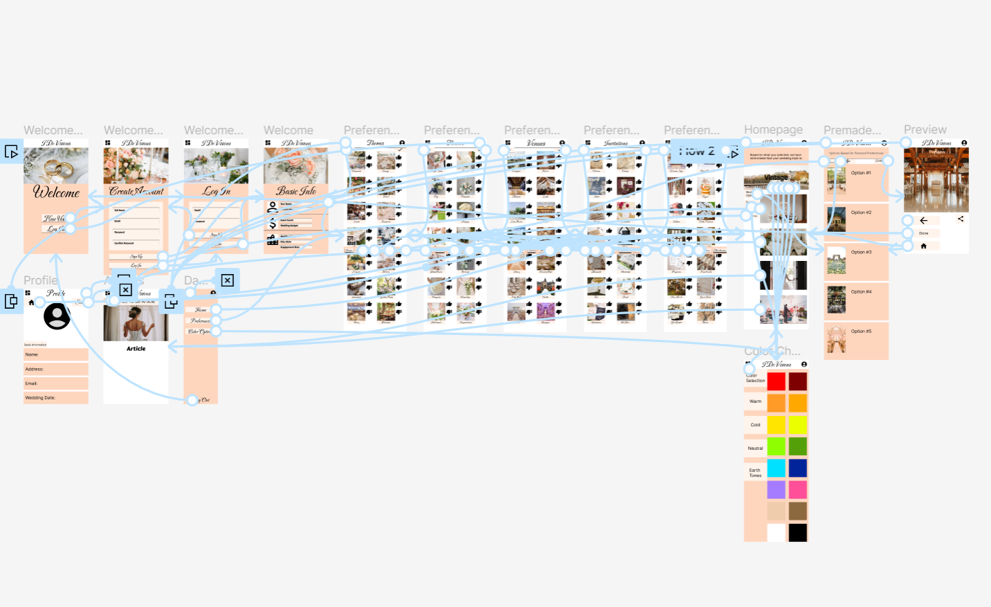
Starting The Design
The app's design was based on user feedback and user research, with a focus on addressing user pain points and ensuring a quick ordering process for the home screen. The app was designed to be user-friendly, with easy navigation and options for wedding planning. A low-fidelity prototype was created using the digital wireframes, connecting the primary user flow of selecting preferences and choosing a wedding design option, allowing it to be used in a usability study.
Refining The Design
The app's initial designs allowed users to start at the app's start, but after usability studies, options for sign-up or login were added at the app's start. The design was revised to avoid overwhelming users with a simple color palette.
A second usability study revealed confusion with the preferences banner, so the banner was lowered to maintain consistency at the bottom and highlighted with shadows to indicate the current page.


Provided access to users who are vision impaired through adding alt text to images for screen readers.
Accessibility Considerations
Used icons on navigation to make flow easier and also on the preferences page to help users better understand the design
Plan to use design features that bring bold awareness if something is incorrect or incomplete to also better the design and overall flow process